Wednesday, July 29, 2009

Front Cover - Lovely Lily


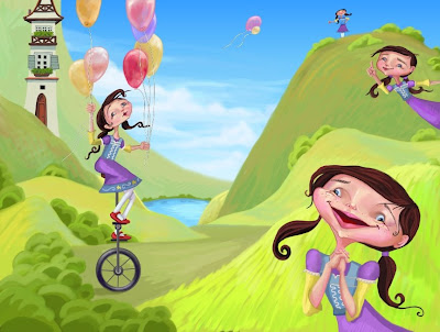
Lily is a minxy playful, laughable character. What else but an zesty crimson could do the trick for Lily's front and center debut. Definately the final pick for Lily's opening number, cover story. I just got back from a fantastic experience at the publishers in Utah! http://www.printechutah.com. (contact: David Archer) They were so wonderful and generous to show me around. I learned bucket loads of info about how to print, cut, and mass produce a book. I would recommend a field trip here for anyone interested in learning more!

Page 12 A Mess!


It is labor trying to make someone look messy! I'm telling you. soo hard. Thats when I came up with the idea of putting chilis in the hair. Much less goopy, but still, messy perhaps? (note to good sound publishing) Can I just say... Abigail Richards you are absolutely the best! Your expressions are dynamite! Thanks for your modeling help. This illustration is dedicated to you girl!

Page 11 Chips and Chili Yikes!


Thank goodness for bloomers. Chips and chili you say?...well, a few thrown in the air for good illustration reference sake...got to have it accurate!

Page 10 Night


Maxfield Parish comes in handy when trying to do an almost dusk to night scene. You gotta love those golden age illustration masters! They just do it so right. Also, thanks to Rachel Packard for the lampshade idea. Genius! Obviously Lily's imagination is getting the better of her!

Page 8 Ladybug


How does one put pink pajamas on a ladybug? so many legs. Why not make her wings pink and put a sleeping cap on. That should do the trick. I learned a lot about painting clusters and fields of daisies! phew. You squint your eyes to get the basic shapes of white against green. Notice that shapes get thinner and shorter the further back...they also meld together. Less green stem space. Lots of fun!

Page 7- Leaping over Leopards


I went running one morning and noticed that the very early morning gives off a fabulous pink hue! A sunrise ilustration. I also felt like Lily should be tiny and far away. This helps with the pacing of the book... keeping the viewer interested by switching between up close and far awy shots. Good Sound Publishing also suggested that I needed a second leopard to match the words...working out perfectly because, well, everyone, even leopards need a lover when they are lounging on a divine plush couch right!

Monday, June 22, 2009

Page 5 - Color


This illustration is intended to look hot .... as in sweltering! I thought I might put a bright sun behinde Lily's head and then do a radial gradient fill out to the edges. I figured out a couple of good tips while using gradients... never use just 2 colors ie (beginning color and end color) because the colors blending in between get mushy and cloudy. You want to punch in a couple of medium hues on your gradient slider to get those mid tones popping! Here is the type as well...my first attempt at laying in type...I can't believe how easy it is. I love Adobe products!

Monday, June 15, 2009

Page 5- Leap Leap Leap


Lily loves to Leap! How to draw a leaping girl? hmm...that was a challenge. I started by taking photos of some of my art students to figure out the geusture..but then suddenly a thought from a couple years ago came to mind. I had been hiking in cal poly through the woods, when I came upon a woman suspended 20 feet from the ground by a long crimson cloth, holding an arabesque pose. I was stunned...I came to find out that this woman was an aerial dancer. Remembering this image triggered an idea to create Kilys leaping gestures. Aerial dancing is athletic and graceful. Lily needed to be energetic, but still feminine. These are some of the arresting poses I came up with for Lily.

Monday, June 08, 2009

Page 4 - Unicycle


So Windy Hill, CA is the inspiration for this color scheme. I was having the hardest time coloring the hills...I wanted them to look like spring grass. In April on my birthday Matt and I hiked to the peak and took dozens of photos. You would be surprsied how close in value the hills actually are compared with the sky. I had to squint my eyes to check and see which one is darker. Turns out the hills do make a sillouette against a lighter sky. This illustration took almost 12 hours to complete...but believe it or not, Lily's house in the background took only half an hour! Its one of those things where you just feel it and you do it and it works! Rare moments in painting I must say. Also, this was my first for painting balloons. Balloons are cool. They reflect the colors of the sky and the colors of the balloons around them. They are transparent in the middle and opaque on the bottom and top. Who knew!

Tuesday, June 02, 2009

Page 4 - Lily loves the outdoors


Lily has all sorts of tricks up her sleeve, among which is unicylce riding! This illustration was inspired by the rolling foothills of my dear old Cupertino CA. I also wanted to mix in a German village flair...those tudor houses are soo cool! Art tip: objects get smaller with distance. In a 2D drawing, usually far objects are small and in the upper half of the page. Objects close are large and in the bottom half of the page.

Monday, June 01, 2009

Page 3 - Color


What but a hot pink shower cap could be the most perfect thing for singing in the shower! As you can see, Lily is a bit of a free spirit...perhaps a shadow of the girl creating her! Yes, I think Lily embodies all of my own deesecret loves!. On the right page...Lily watches while the bubbles float out hte window, something I love to do any chance I get around bubbles at weddings or the like. Did you know that bubbles are a myriad of colors? Yes, they come wearing pink, blue, purple, green and lime. I created these bubbles starting with a translucent white cirlce and painting transparante layers of color ont he top and bottom of the bubbles...which is where most of the color congregates. Enjoy bubbles today!

Page 3 - She loves to sing


Color to come soon

Wednesday, May 13, 2009

Lovely Lily Page 2 - full color


I've been using corel painter x for these illustrations. It has been quite a learning curve, but very fun. It is such a powerful programm! Oil paints, watercolors, acrylics! Amazing. I also bought an intuos wacom pen and tablet to help facilitate the painting style. It is magical!

Sketch- Lily Page#2


Many people have been asking "where is angela?" Well, it just so happens that I have been amusing myself with the wiles and antics of a very minxy 5 year old girl named Lily. Yes, my character from Angie Holzer's book "Lovely Lilly" has come to life at the drawing table. Alas, cherished walks at the stanford dish, evening chats over gelato....all must be put on the back burner. I'm sorry friends, the fun will just have to wait. However, in recompense for my absense I've decided to share with all of you the unravelings of Lily's story within my own story ...from concept to finished painting, in hopes that you will feel apart of my life...even if it is only in cyber space. :)

Words to Page 1 below are as follows: "Here is lovely Lily looking proper but really...." Page 2 here tells us the complete story of who Lily really is! and she's not so proper.."she love's to wiggle, she loves to giggle, and act a little silly". Can any one tell that she wants to be a rodeo girl? Color layout to come soon! stay posted

Thursday, April 09, 2009

Lovely Lilly - Page 1


Hooray! Back to the scribbles with new energy! I have burrowed in the den of my room for months, years, painting and repainting and drawing and tossing. phew! I feel like van gogh or something. Here is the first page for my second illustrated children's book called Lovely Lilly written and published by Angie Holzer. It has been a fantastic opportunity...or should I just say extreme growing experience? Ive learned tons! Thanks to Angie and Good Sound Publishing. Stay tuned for more of Lily! she looks proper but really?......